就是很像开关的那种控件,它只有两个状态:on和off:在IOS中,有个UISwitch控件,其效果图,如下: 
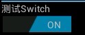
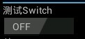
在android4.0里面,添加了一个和这个类似的控件:Switch,很形象,开关。效果图如下:
其类关系图如下:
父类:compoundButton。
类的概述:
Switch是一个可以在两种状态切换的开关控件。用户可以拖动"thumb"来回选择,也可以像选择复选框一样点击切换Switch的状态。
主要方法:
Public Methods
| <nobr>int</nobr> |
<nobr><span class="sympad" style="margin-right: 2px; "><a href="http://developer.android.com/reference/android/widget/Switch.html#getCompoundPaddingRight()" style="color: rgb(0, 102, 153); text-decoration: none; ">getCompoundPaddingRight</a></span>()</nobr> Returns the right padding of the view, plus space for the right Drawable if any.
|
| <nobr><a href="http://developer.android.com/reference/java/lang/CharSequence.html" style="color: rgb(0, 102, 153); text-decoration: none; ">CharSequence</a></nobr> |
<nobr><span class="sympad" style="margin-right: 2px; "><a href="http://developer.android.com/reference/android/widget/Switch.html#getTextOff()" style="color: rgb(0, 102, 153); text-decoration: none; ">getTextOff</a></span>()</nobr> Returns the text displayed when the button is not in the checked state.
|
| <nobr><a href="http://developer.android.com/reference/java/lang/CharSequence.html" style="color: rgb(0, 102, 153); text-decoration: none; ">CharSequence</a></nobr> |
<nobr><span class="sympad" style="margin-right: 2px; "><a href="http://developer.android.com/reference/android/widget/Switch.html#getTextOn()" style="color: rgb(0, 102, 153); text-decoration: none; ">getTextOn</a></span>()</nobr> Returns the text displayed when the button is in the checked state.
|
| <nobr>void</nobr> |
<nobr><span class="sympad" style="margin-right: 2px; "><a href="http://developer.android.com/reference/android/widget/Switch.html#jumpDrawablesToCurrentState()" style="color: rgb(0, 102, 153); text-decoration: none; ">jumpDrawablesToCurrentState</a></span>()</nobr>
|
| <nobr>void</nobr> |
<nobr><span class="sympad" style="margin-right: 2px; "><a href="http://developer.android.com/reference/android/widget/Switch.html#onMeasure(int,%20int)" style="color: rgb(0, 102, 153); text-decoration: none; ">onMeasure</a></span>(int widthMeasureSpec, int heightMeasureSpec)</nobr>Measure the view and its content to determine the measured width and the measured height. |
| <nobr>void</nobr> |
<nobr><span class="sympad" style="margin-right: 2px; "><a href="http://developer.android.com/reference/android/widget/Switch.html#onPopulateAccessibilityEvent(android.view.accessibility.AccessibilityEvent)" style="color: rgb(0, 102, 153); text-decoration: none; ">onPopulateAccessibilityEvent</a></span>(<a href="http://developer.android.com/reference/android/view/accessibility/AccessibilityEvent.html" style="color: rgb(0, 102, 153); text-decoration: none; ">AccessibilityEvent</a>event)</nobr>
|
| <nobr>boolean</nobr> |
<nobr><span class="sympad" style="margin-right: 2px; "><a href="http://developer.android.com/reference/android/widget/Switch.html#onTouchEvent(android.view.MotionEvent)" style="color: rgb(0, 102, 153); text-decoration: none; ">onTouchEvent</a></span>(<a href="http://developer.android.com/reference/android/view/MotionEvent.html" style="color: rgb(0, 102, 153); text-decoration: none; ">MotionEvent</a>ev)</nobr> Implement this method to handle touch screen motion events.
|
| <nobr>void</nobr> |
<nobr><span class="sympad" style="margin-right: 2px; "><a href="http://developer.android.com/reference/android/widget/Switch.html#setChecked(boolean)" style="color: rgb(0, 102, 153); text-decoration: none; ">setChecked</a></span>(boolean checked)</nobr>Changes the checked state of this button. |
| <nobr>void</nobr> |
<nobr><span class="sympad" style="margin-right: 2px; "><a href="http://developer.android.com/reference/android/widget/Switch.html#setSwitchTextAppearance(android.content.Context,%20int)" style="color: rgb(0, 102, 153); text-decoration: none; ">setSwitchTextAppearance</a></span>(<a href="http://developer.android.com/reference/android/content/Context.html" style="color: rgb(0, 102, 153); text-decoration: none; ">Context</a>context, int resid)</nobr> Sets the switch text color, size, style, hint color, and highlight color from the specified TextAppearance resource.
|
| <nobr>void</nobr> |
<nobr><span class="sympad" style="margin-right: 2px; "><a href="http://developer.android.com/reference/android/widget/Switch.html#setSwitchTypeface(android.graphics.Typeface,%20int)" style="color: rgb(0, 102, 153); text-decoration: none; ">setSwitchTypeface</a></span>(<a href="http://developer.android.com/reference/android/graphics/Typeface.html" style="color: rgb(0, 102, 153); text-decoration: none; ">Typeface</a>tf, int style)</nobr> Sets the typeface and style in which the text should be displayed on the switch, and turns on the fake bold and italic bits in the Paint if the Typeface that you provided does not have all the bits in the style that you specified.
|
| <nobr>void</nobr> |
<nobr><span class="sympad" style="margin-right: 2px; "><a href="http://developer.android.com/reference/android/widget/Switch.html#setSwitchTypeface(android.graphics.Typeface)" style="color: rgb(0, 102, 153); text-decoration: none; ">setSwitchTypeface</a></span>(<a href="http://developer.android.com/reference/android/graphics/Typeface.html" style="color: rgb(0, 102, 153); text-decoration: none; ">Typeface</a>tf)</nobr> Sets the typeface in which the text should be displayed on the switch.
|
| <nobr>void</nobr> |
<nobr><span class="sympad" style="margin-right: 2px; "><a href="http://developer.android.com/reference/android/widget/Switch.html#setTextOff(java.lang.CharSequence)" style="color: rgb(0, 102, 153); text-decoration: none; ">setTextOff</a></span>(<a href="http://developer.android.com/reference/java/lang/CharSequence.html" style="color: rgb(0, 102, 153); text-decoration: none; ">CharSequence</a>textOff)</nobr> Sets the text displayed when the button is not in the checked state.
|
| <nobr>void</nobr> |
<nobr><span class="sympad" style="margin-right: 2px; "><a href="http://developer.android.com/reference/android/widget/Switch.html#setTextOn(java.lang.CharSequence)" style="color: rgb(0, 102, 153); text-decoration: none; ">setTextOn</a></span>(<a href="http://developer.android.com/reference/java/lang/CharSequence.html" style="color: rgb(0, 102, 153); text-decoration: none; ">CharSequence</a>textOn)</nobr> Sets the text displayed when the button is in the checked state.
|
getCompoundPaddingRight():没弄清楚什么意思。
在TextView中的源码:
jumpDrawableToCurrentState():在与Switch相关的Drawable操作时调用Drawable.jumpToCurrentState()这个方法。
getTextOff()、getTextOn()、setTextOff()、setTextOn()这四个方法比较简单,就是设定和获取非选中和选中状态下的文本值。
onMeasure():测量控件宽高,供绘图时使用。
onTouchEvent(MotionEventev)实现这一方法传递触摸屏运动事件。
setChecked()设置Switch的状态(选中,非选中)
setSwitchTextAppearance()设置字体大小
setSwitchTextTypefaces设置字体格式
看看google官方在/frameworks/base/core/res/res/values/styles.xml的一个定义:
可以在main.xml中这样定义:
当Switch状态切换时:
基本上先简单的讲到这。
分享到:


相关推荐
一个Activity掌握Android4.0新控件: Android4.0新控件Switch,Space,GridLayout,PopupMenu,TextureView的简单使用。
NULL 博文链接:https://chengxibeauty.iteye.com/blog/1530139
在本教程中,我会演示如何定制Switch控件,添加单击监听器,使用Switch去控制媒体声音和wifi设备。
提取android4.0 switch控件源码,仅供参考
.net 4.0 Ajax控件安装程序 AJAX Control Toolkit .NET 4 - Binary – AJAX Control Toolkit for .NET 4 and sample site (Recommended).
修改官方Switch控件的自定义Switch,支持所有SDK,修改后的MySwitch控件接口基本与原Switch控件一致,并且除了可支持所有SDK外,增加了2项小功能: 1. 支持用Track背景图片的方式代替Texton Textoff等文字方式表现...
详解Flex4.0自定义控件的开发步骤以及注意事项
从Android4.0源码中分离出Switch控件
Ehlib v4.0 报表控件经典版..rar
Android其它新控件,Drawerlayout(抽屉布局),SwipeRefreshLayout(滑动刷新布局)的基本使用
自己实现了一个自定义控件,Switch。代码已经很久了,不知道还可不可以用。 欢迎下载哈。有问题可留言或私信
android完美下拉框控件android完美下拉框控件android完美下拉框控件android完美下拉框控件
由于android4.0以上的开发,涉及到网络部分不许在UI主线程中进行,否则会报错,但是UI控件又不能在子线程中操作。该代码利用两个handler完美结合,实现了网络请求,控件更新两不误。解压之后记得将两个工程都加入到...
extjs 4.0 的日期时间控制,解压之后放在ext-4.0.7-gpl下的examples文件夹即可。我是下载的csdn别人的版本改的,别人给的是英文版。我给改成了中文版。
Android4.0入门之Activity返回参数: 开发流程梳理: 1.对界面进行布局(在layout目录下配置每个Activity对应的xml) 2.书写Activity类,获取控件、添加时间(新增Activity后,切记到配置Activity文件中去注册) ...
web打印控件【lodop4.0.0.1】 控件+Demo 基本需要的功能都能实现
这个Demo主要实现如何将Android下几个原生的控件封装到一起,产生一个新的控件,称之为“android自定义组合控件”,这种控件可以简化代码,大家有空下载看看吧,谢谢!
lodop4.0 web打印控件
基于android的Switch控件自定义,自己可以根据自己的爱好随意设置颜色和背景
很给力的安卓控件,适合4.0风格的设计,希望对大家有用吧